A pregnancy bola without a chain is not jewellery.
A pendant that chimes quietly against an expectant mother’s bump. It sold well – customers just had to buy the chain themselves, and the store barely told them so. The second project from the same client, after Aniball.
The store worked and the pendants sold. But it had a hole exactly where it hurts most. The bola is worn on a chain 100 to 130 cm long, and that chain is not in the box – buy the pendant alone and you go home with jewellery you cannot hang. The store did sell chains, fourteen of them in their own category. A customer simply did not learn about them until a generic "You may also like" strip at the very bottom of the product page – in other words, after the decision rather than inside it.
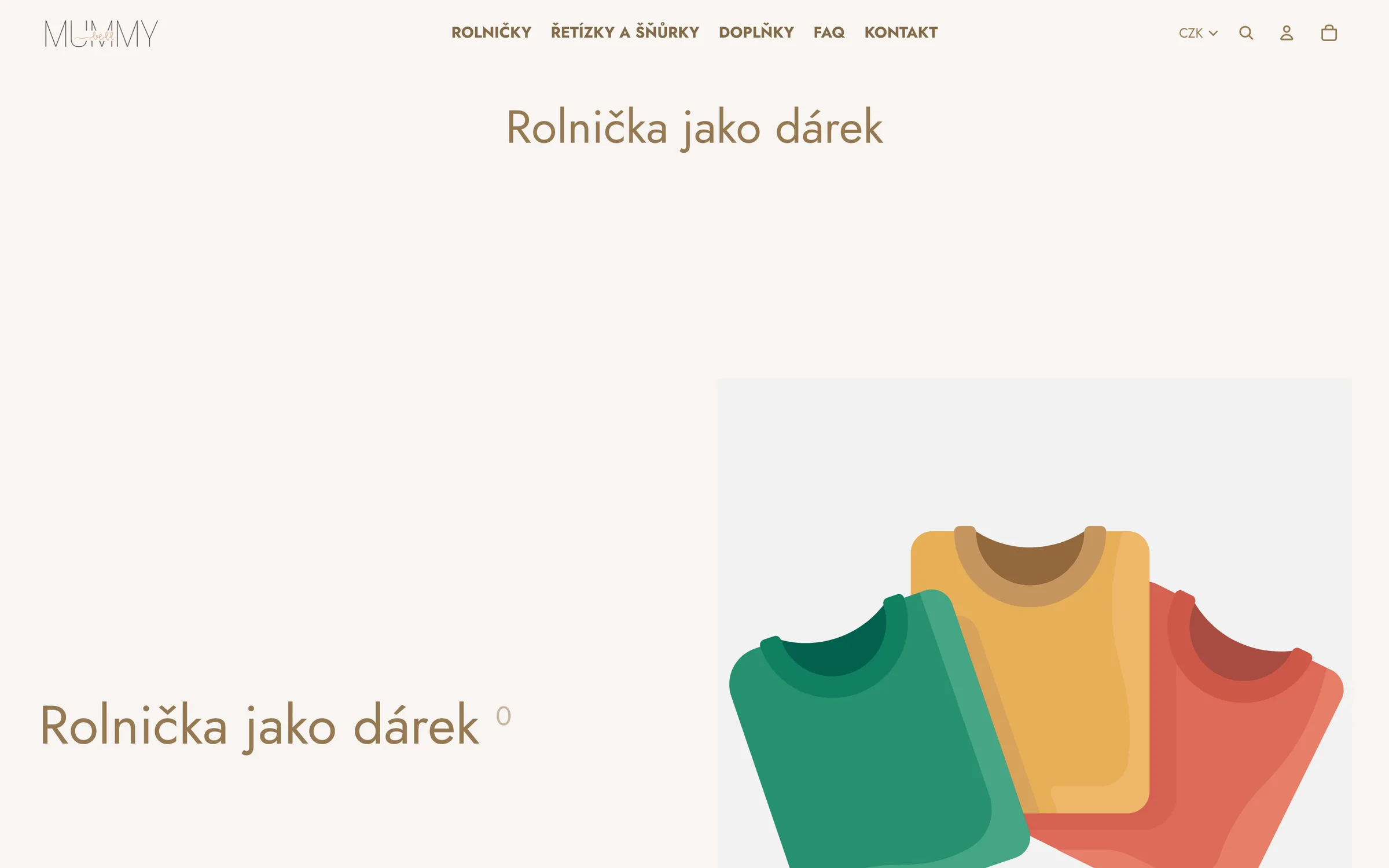
The second problem was gifting. The most common reason to buy is not "I want one for myself" but "I am buying it for somebody" – the store says as much in its own FAQ. Yet the "Bola as a gift" page existed only as an empty shell: a heading, and below it a product listing with not a single product in it.
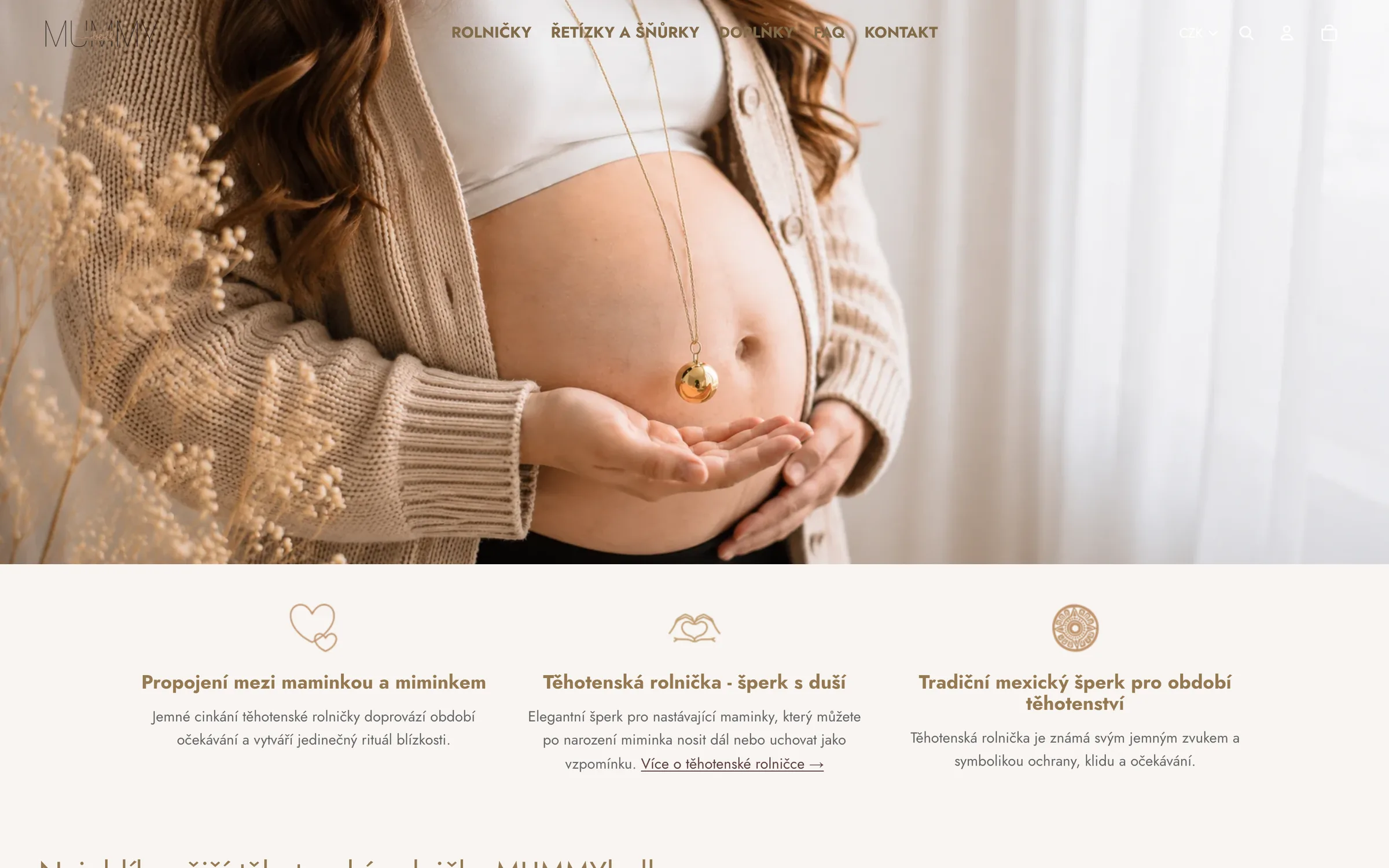
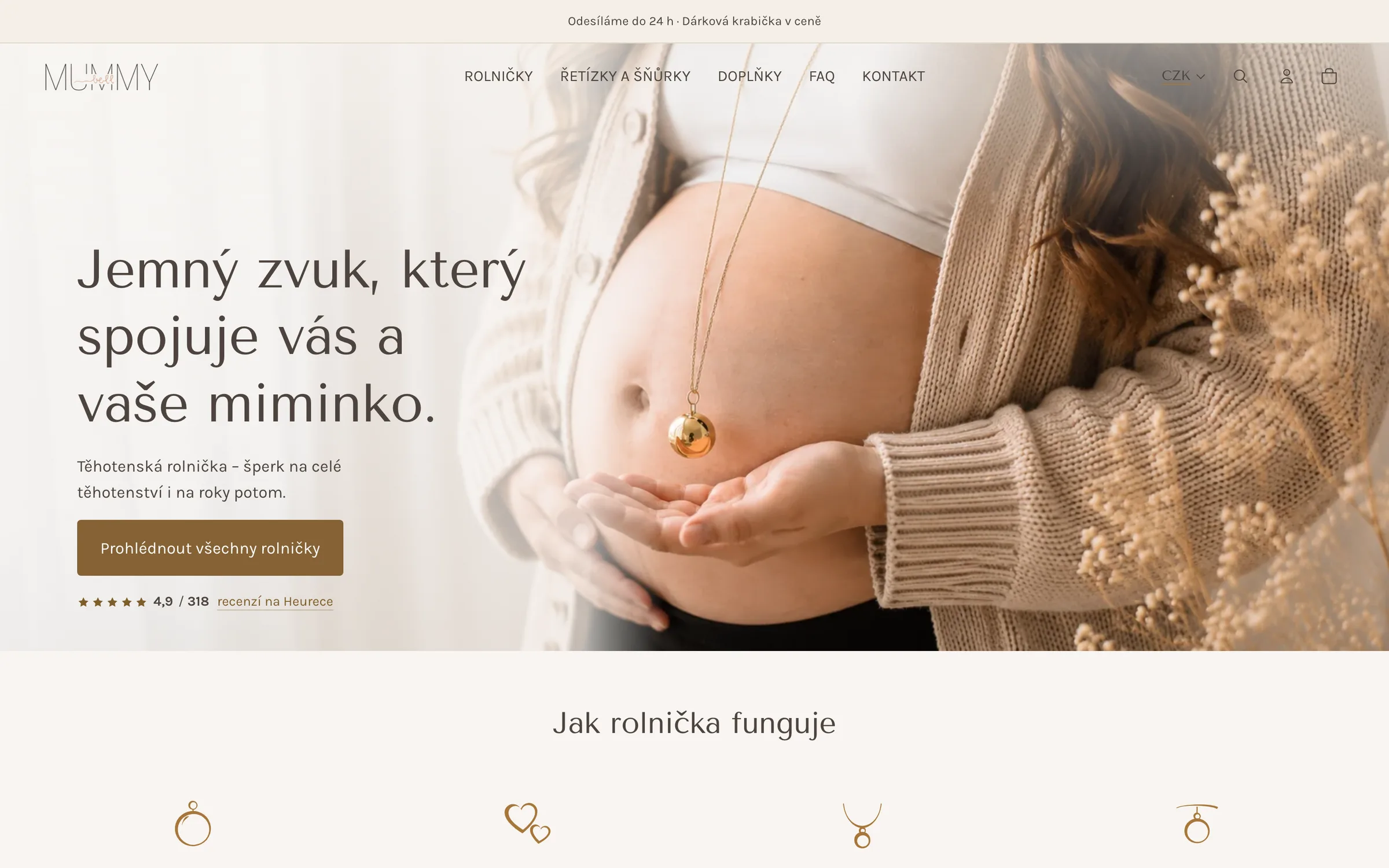
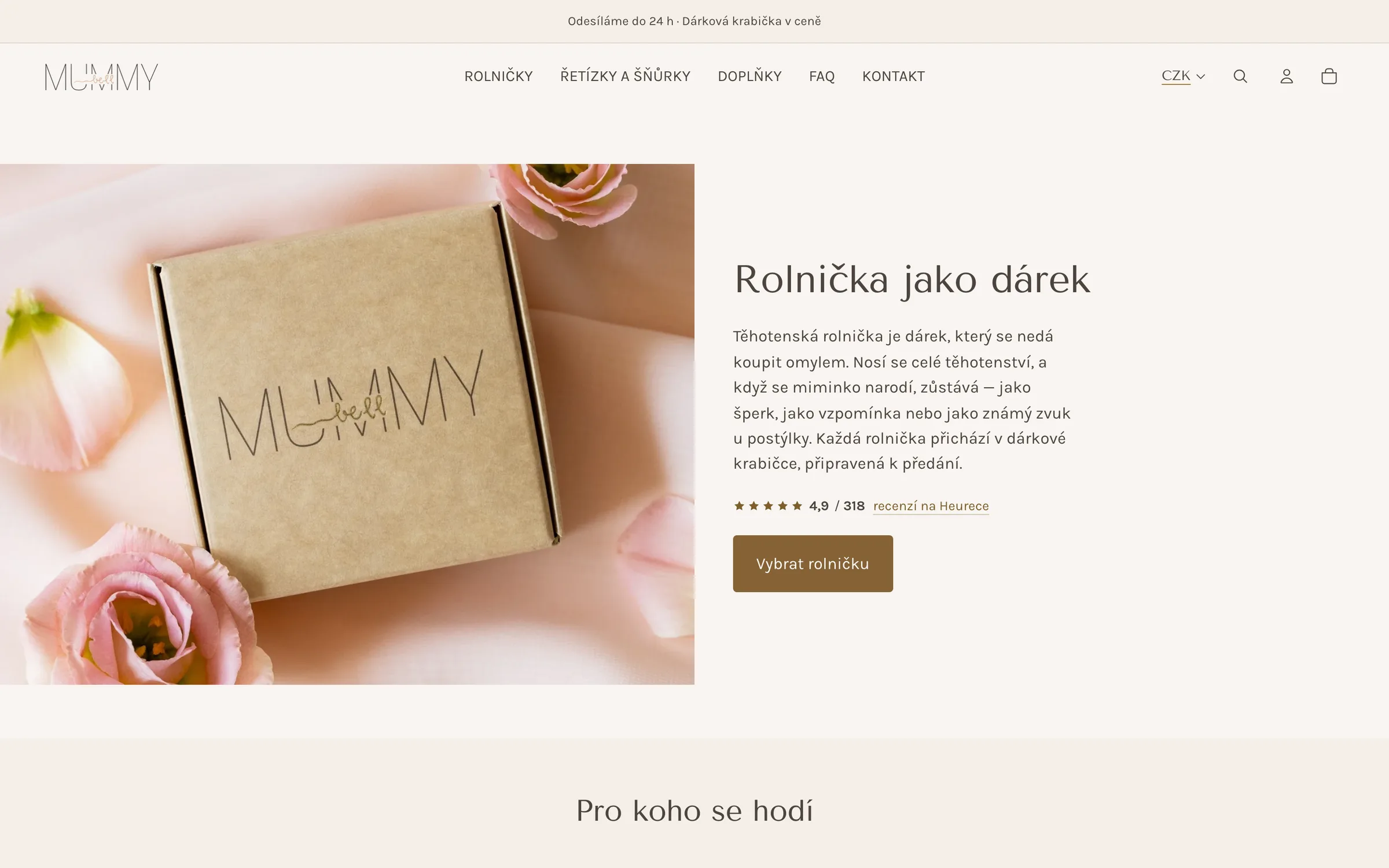
The original homepage opened with a full-screen photograph – not a word on it, and no store rating either. The new one leads with a sentence that says what the product does, and the store rating sits directly underneath. Four points explain how the bola is worn, and anyone choosing a gift gets a button of their own. The FAQ is on the homepage too, before somebody leaves over it.
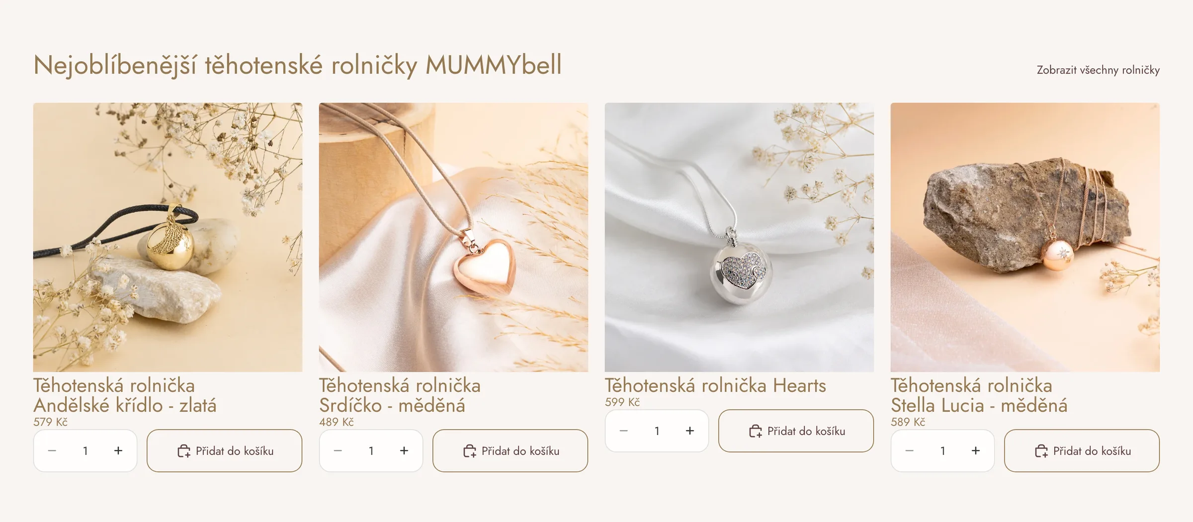
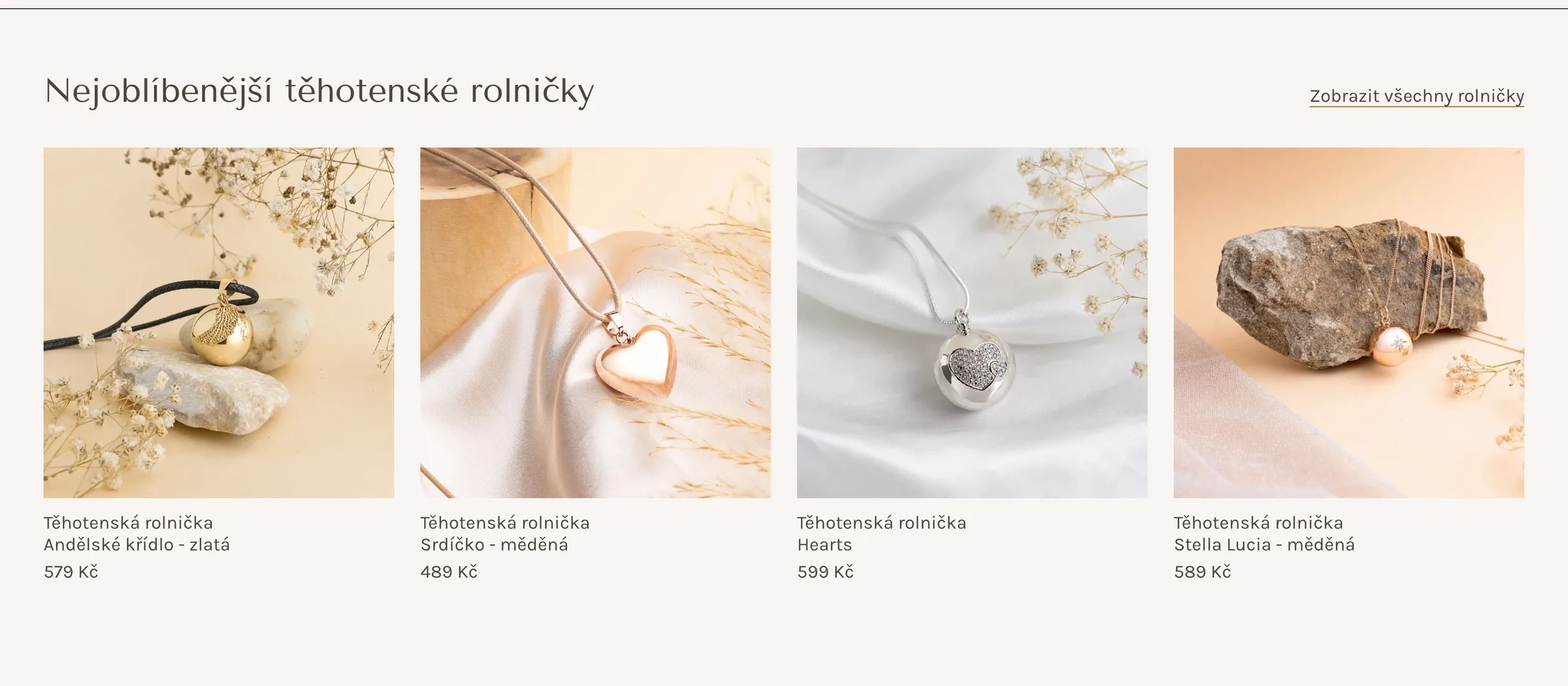
The homepage cards had a quantity stepper under the price and a full Add to cart button. But a bola added from the homepage goes into the cart without a chain – precisely the unusable purchase the whole redesign exists to prevent. The stepper and the button went, and the card now leads to the product page, where the chain is chosen alongside the pendant. A quick Add on hover stayed as a shortcut for anyone who knows exactly what they want.
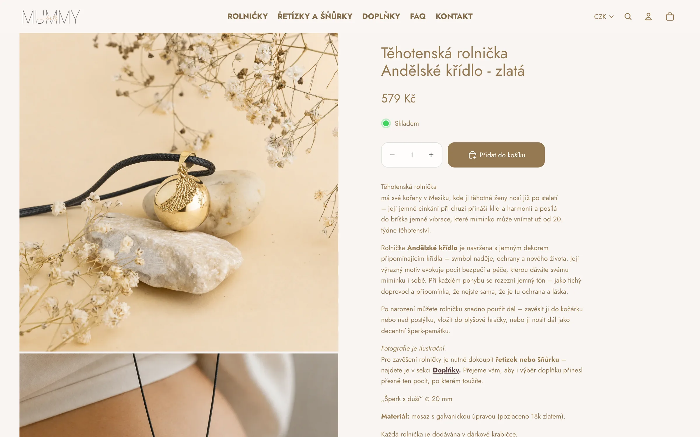
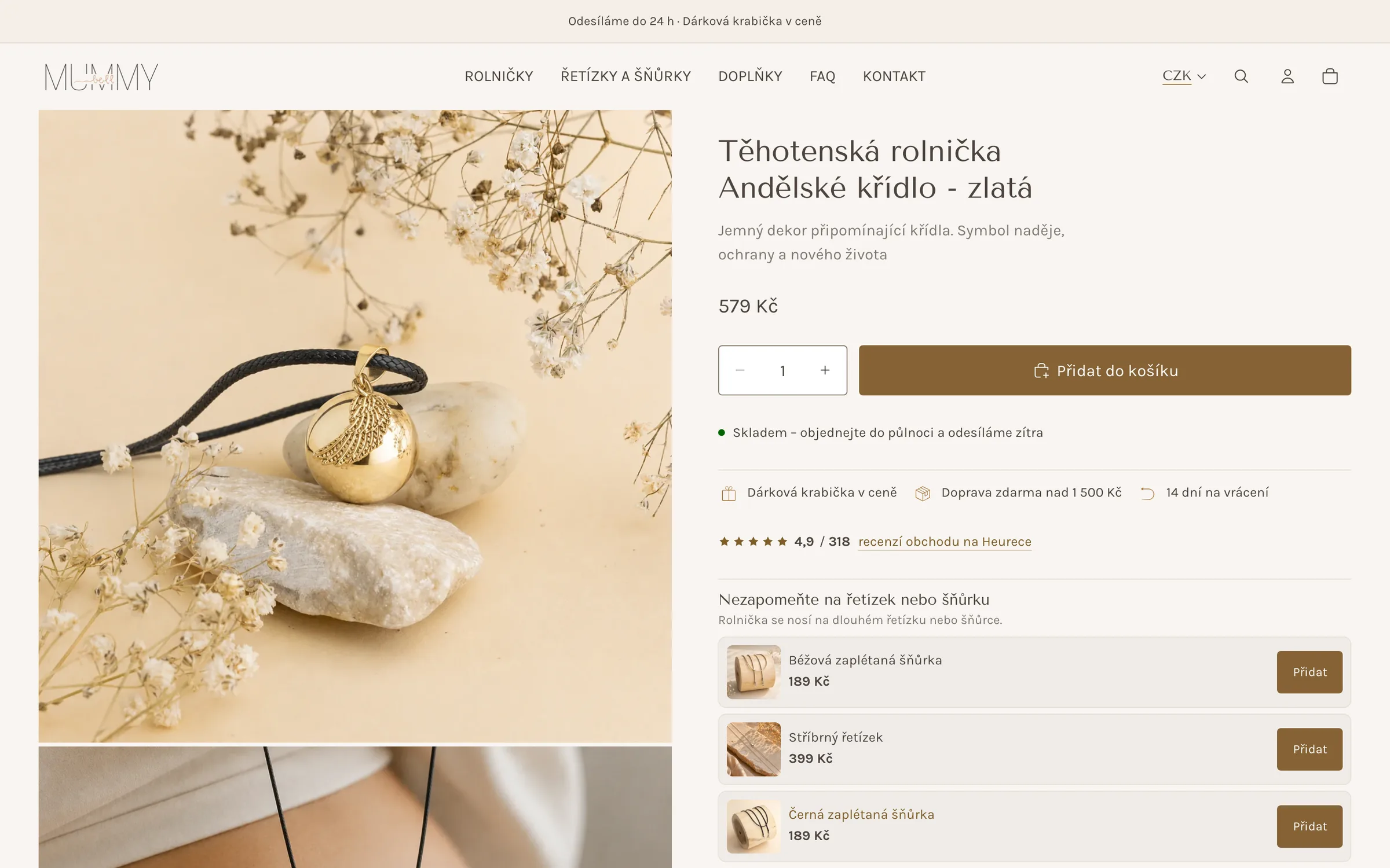
The old page had a gallery, a price, a button and one long paragraph underneath. The new one answers, in order, what the customer is actually asking: what this is, whether it is in stock, what else she needs with it, and what if she is unsure. Three chains with an Add button sit right inside the buy box. The description broke into structured details – size, material, suspension, packaging – and the rest went into collapsible sections.
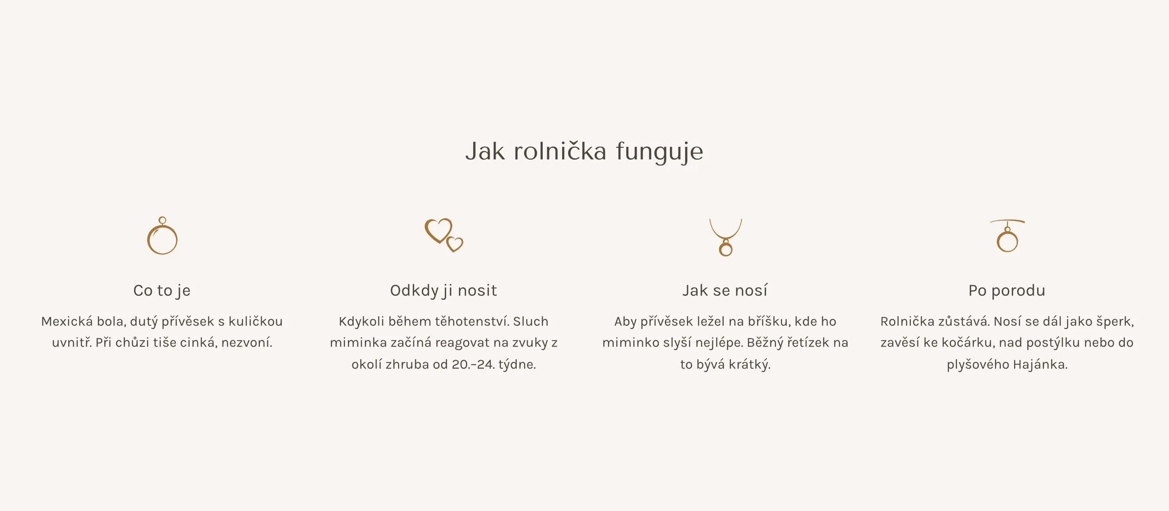
A Mexican bola is an unfamiliar category for most people. What it is, when you start wearing it, how it is worn and what happens to it after the birth – four questions the old page answered buried inside a long paragraph, or not at all. Now they have a strip of their own directly under the buy box, one sentence each.
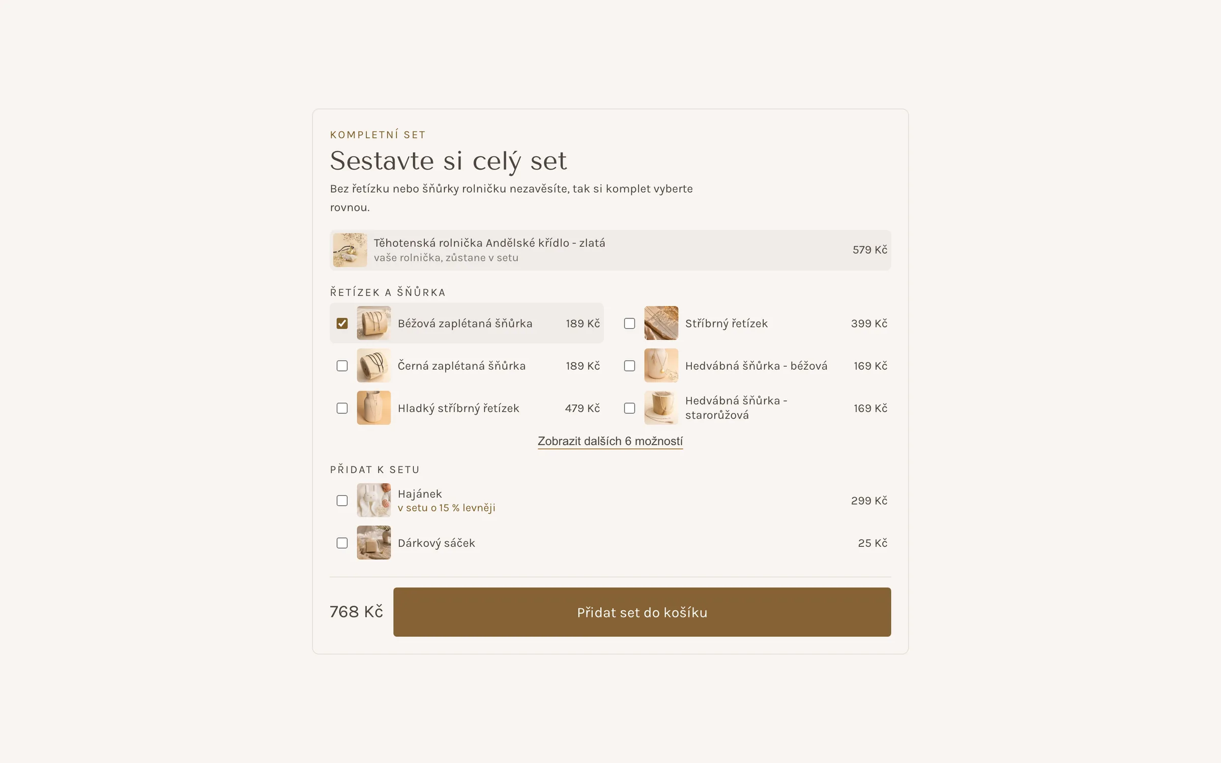
The Complete set section offers twelve chains and cords, plus a comforter and a gift pouch. It totals the price as you go and sends the whole set to the cart with one button. The bola itself has no checkbox – it cannot be removed, because without it there is no set. Anyone who wants the full range has a link to the chain category under the listing.
The discount on the comforter runs through a discount code, so after adding to the cart the section checks whether it actually applied. If it did not, the section hides the discount and shows the full price. Better nothing than a discount that falls apart at the checkout.
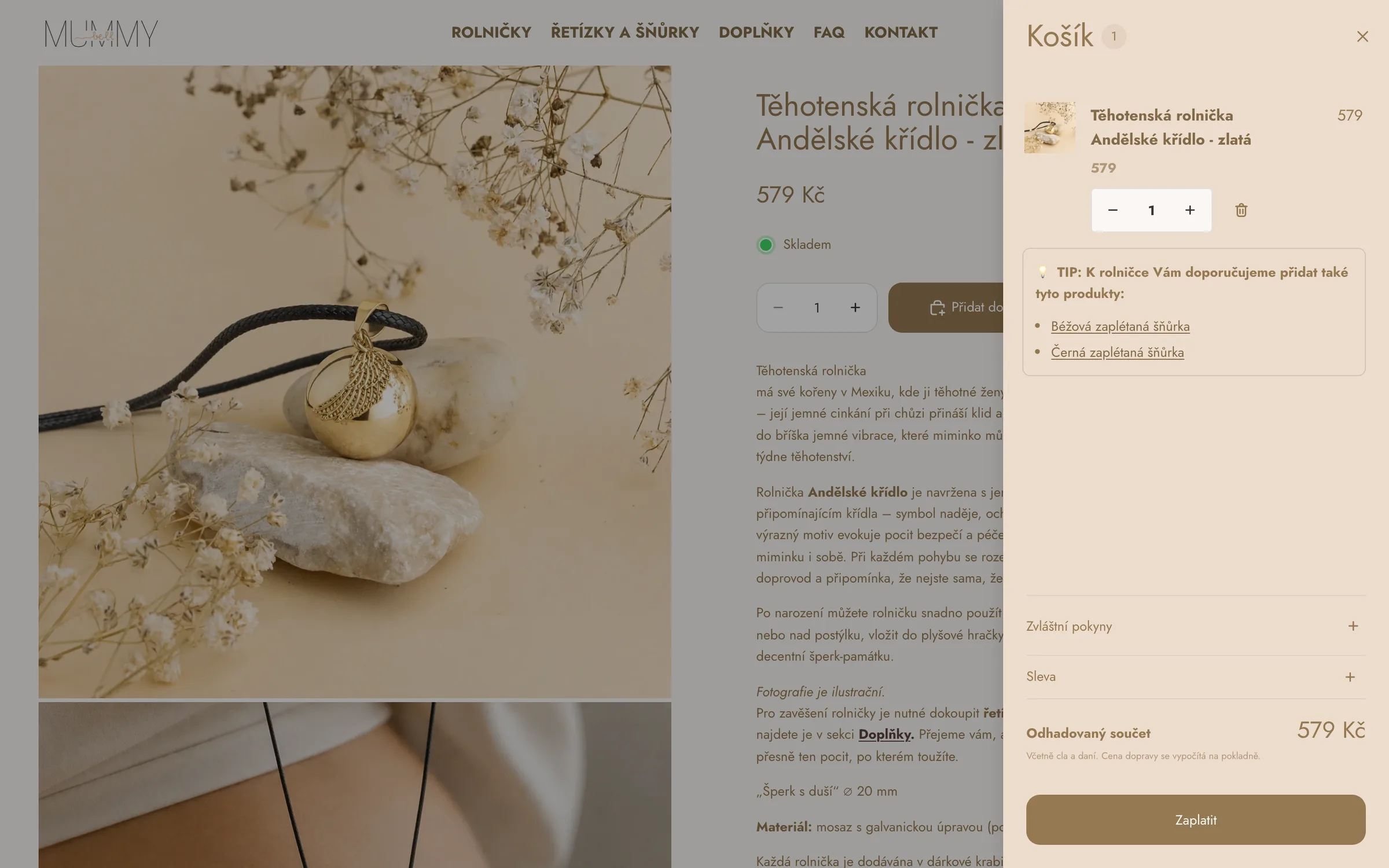
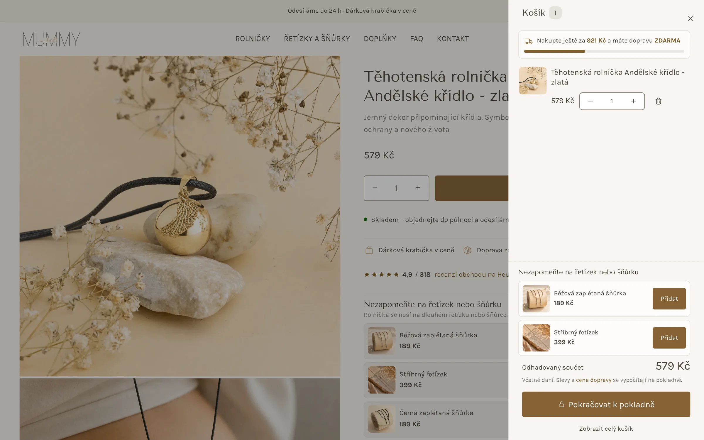
The cart drawer used to recommend add-ons as two underlined words under a box with a lightbulb emoji. Anyone who wanted a chain had to leave the cart, find it and come back. Now every add-on has an image, a price and an Add button, so the purchase can be finished without leaving the cart. A free-shipping progress bar came with it.
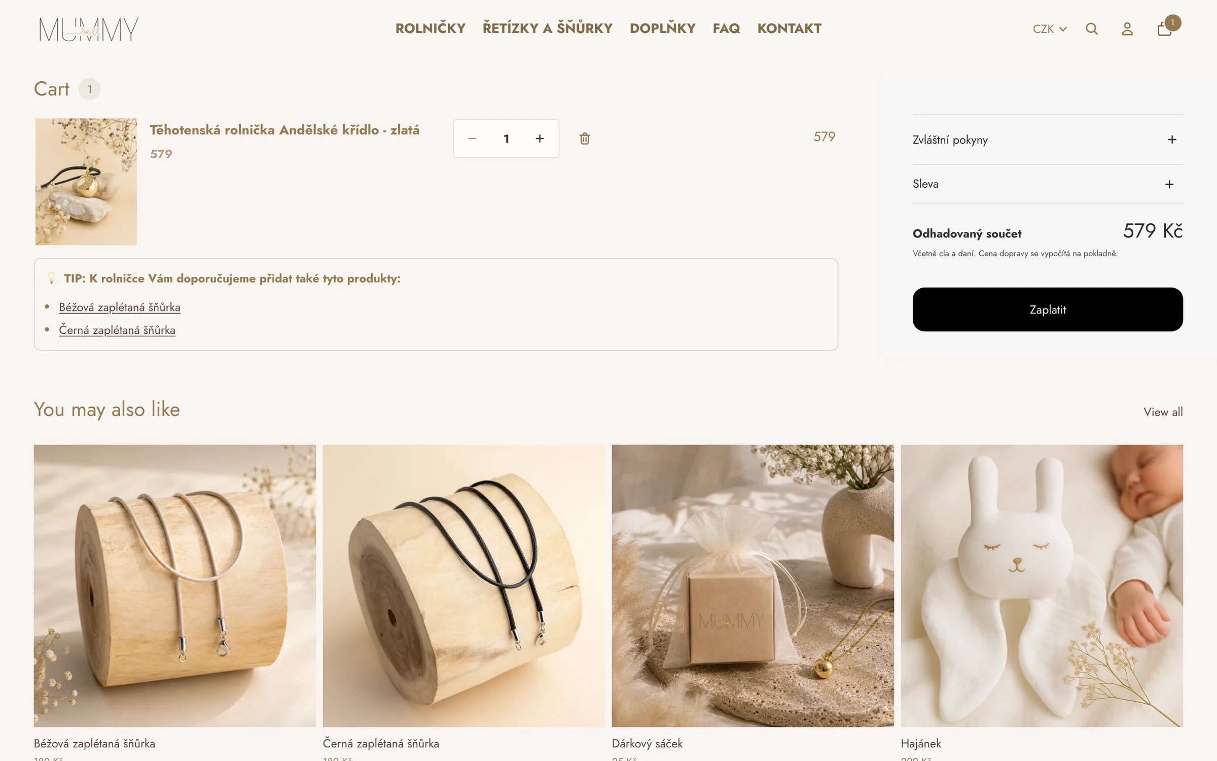
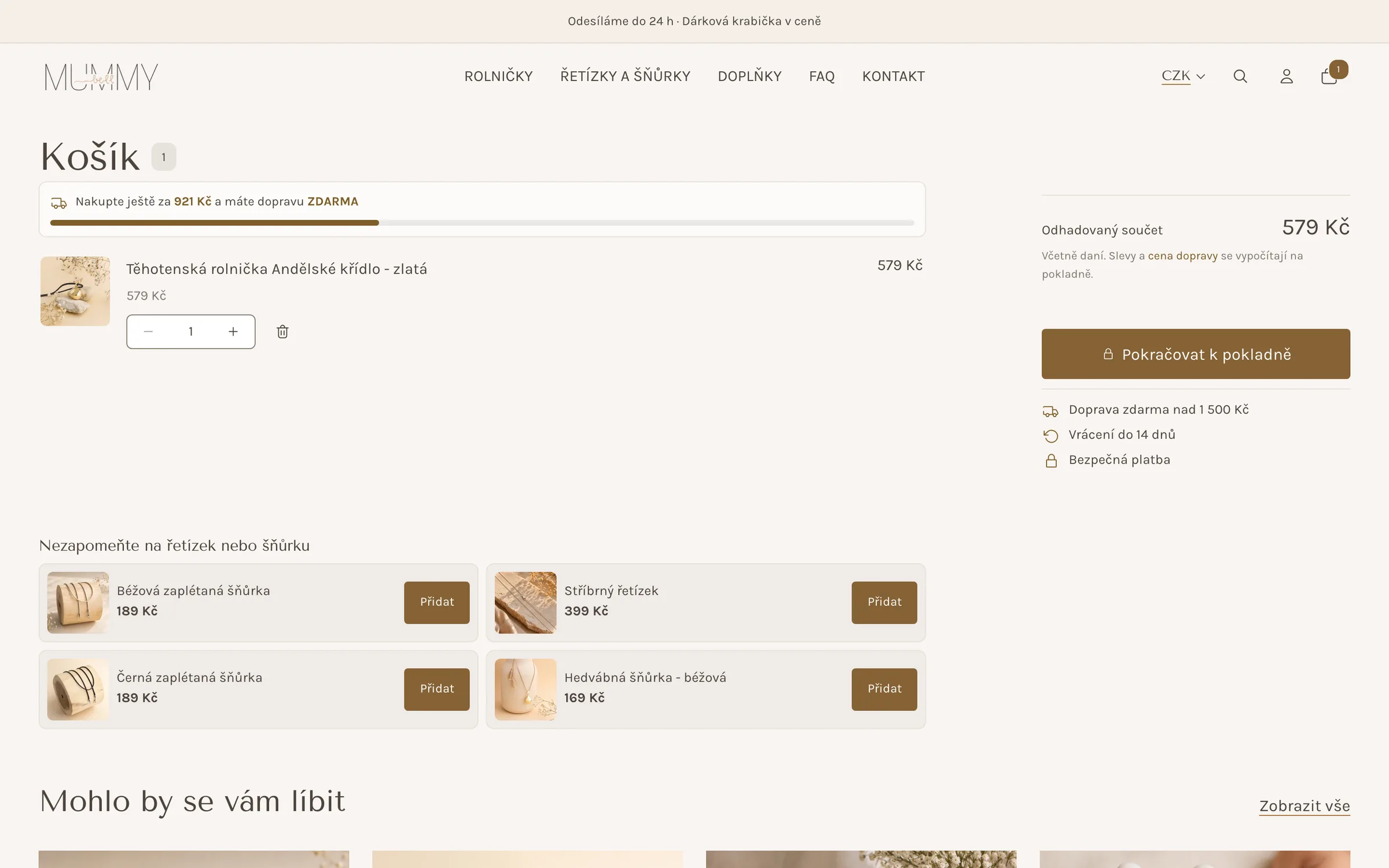
The cart page was a table with not one piece of additional information: a total, a Checkout button and a line about duties and taxes. The new one shows at the top how much is left to reach free shipping, puts the return terms and secure payment under the button, and offers chains between the line items. Leftover English strings from the theme ("Cart", "You may also like") were replaced with properly localised labels – the store sells in Czech and Slovak, and half-translated furniture is the fastest way to look like a dropshipper.
The "Bola as a gift" page existed but was empty – a heading and below it a product listing with nothing in it, including Shopify’s placeholder t-shirt image. Today it sorts by who is giving: partner, baby shower, family and friends. It shows selected pieces, explains the gift wrapping and reminds the buyer that a chain belongs with the pendant.
The complete set and the cross-sell are custom components written directly in the theme. No bundle or upsell app, so no monthly fee and no third-party scripts in the page.
The cart cross-sell knows what is in the cart: a bola without a chain gets chains offered, a chain on its own gets bolas, and both together switch to what people buy alongside. Recommendations come from metafields on specific products and fall back to a collection, so the slot is never empty.
The lowest price in the last 30 days required by the Omnibus Directive is calculated in the template itself, including the Slovak market.
The store runs two markets through Shopify Markets: the Czech domain in koruna, the Slovak one in euros, each with its own translations.
Scope
What the "before" shows.
The "before" screenshots come from a theme backup the client saved before I touched anything – the state I inherited. It is not a perfectly clean start: the cart already carried manual edits from somebody before me, the add-on tip and the order note among them, and the header and footer show traces of the same. The store sells in Czech and Slovak only, so the screenshots and the links are in Czech.