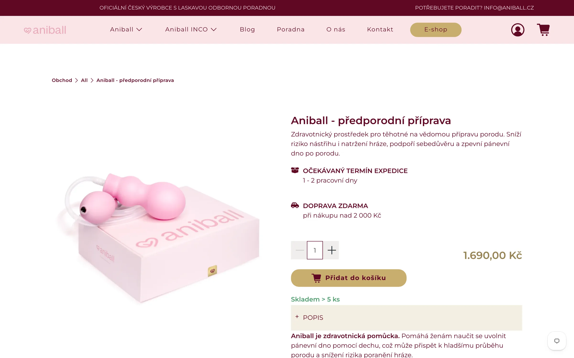
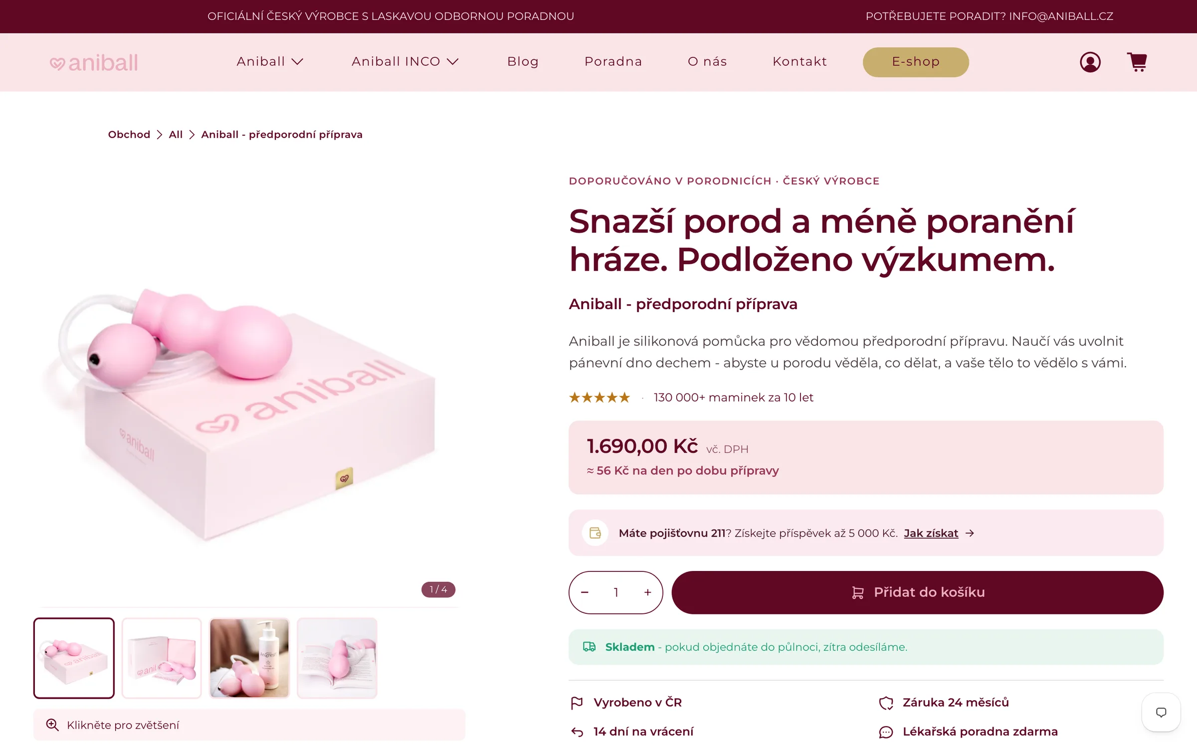
The most important page in the store looked like a template.
A lovebrand selling a pregnancy aid across Europe. I arrived at a store that was already selling – and should have been selling better. It started with one product page.
The store was running and orders were coming in. But the page where the buying decision actually happens was essentially a template: gallery, title, price, button, and a collapsible Description underneath. Aniball is a medical device with a peer-reviewed study behind it and hundreds of thousands of customers – and neither of those was visible on that page. Anyone who was unsure had nothing to hold on to, so they left to look elsewhere.
This was not a disaster. Someone built that page before me and the store sold on it for years. The problem was that it did about a tenth of what it could.
I started with a CRO analysis of the original page and a new order for the sections. What decides the purchase went to the top: what the product helps with, who it has already helped, and what you get for the money. The price gained context ("≈ €2 a day during your preparation") and everything else broke into sections you can skip – whoever is decided buys straight away, whoever hesitates keeps reading.
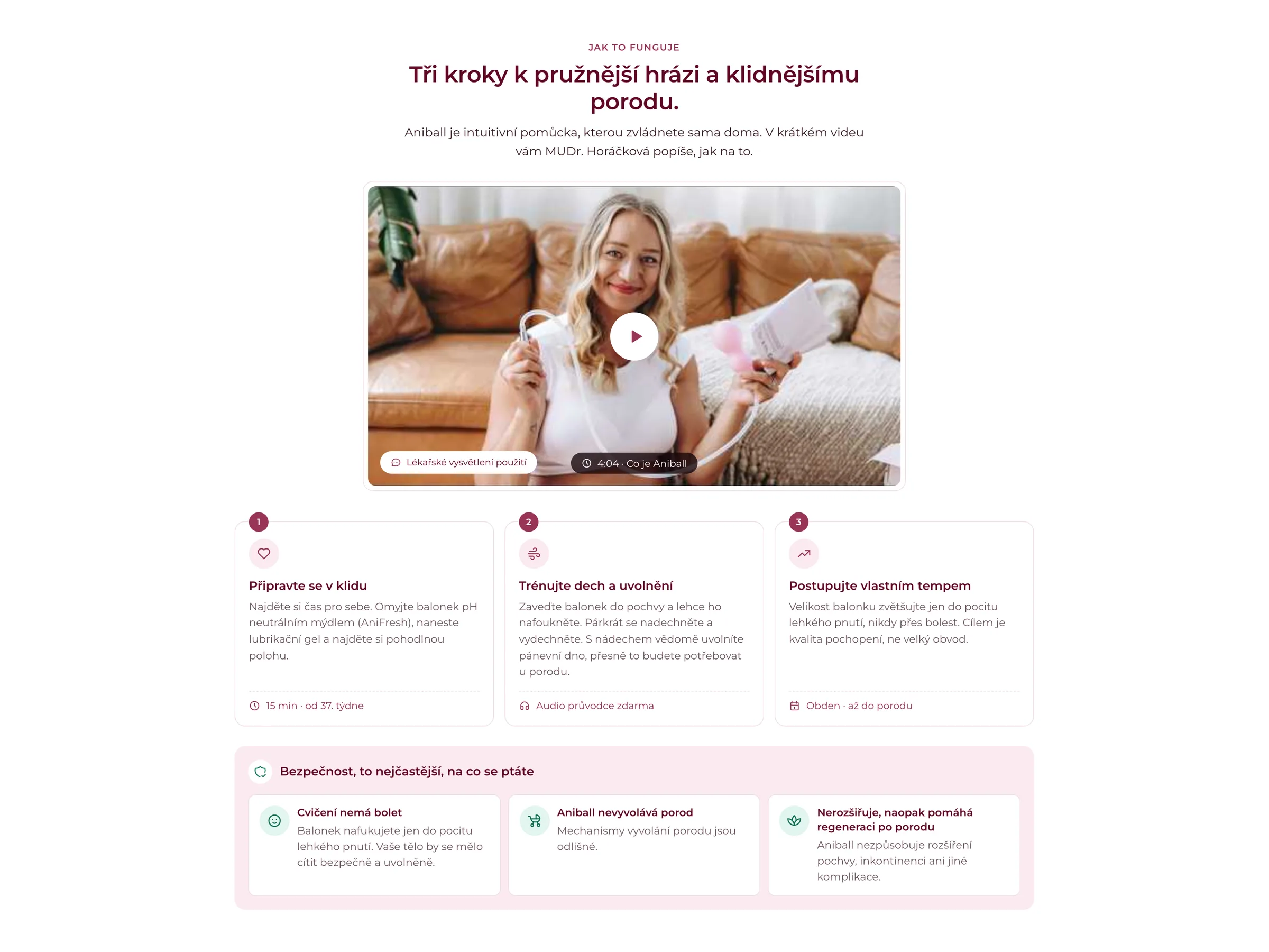
Aniball only works if you know how to use it – and that is the biggest worry before buying. The original page said nothing about it; the instructions arrived in the packaging. The "How it works" section pulled them forward: three steps, each with an image and a single sentence.
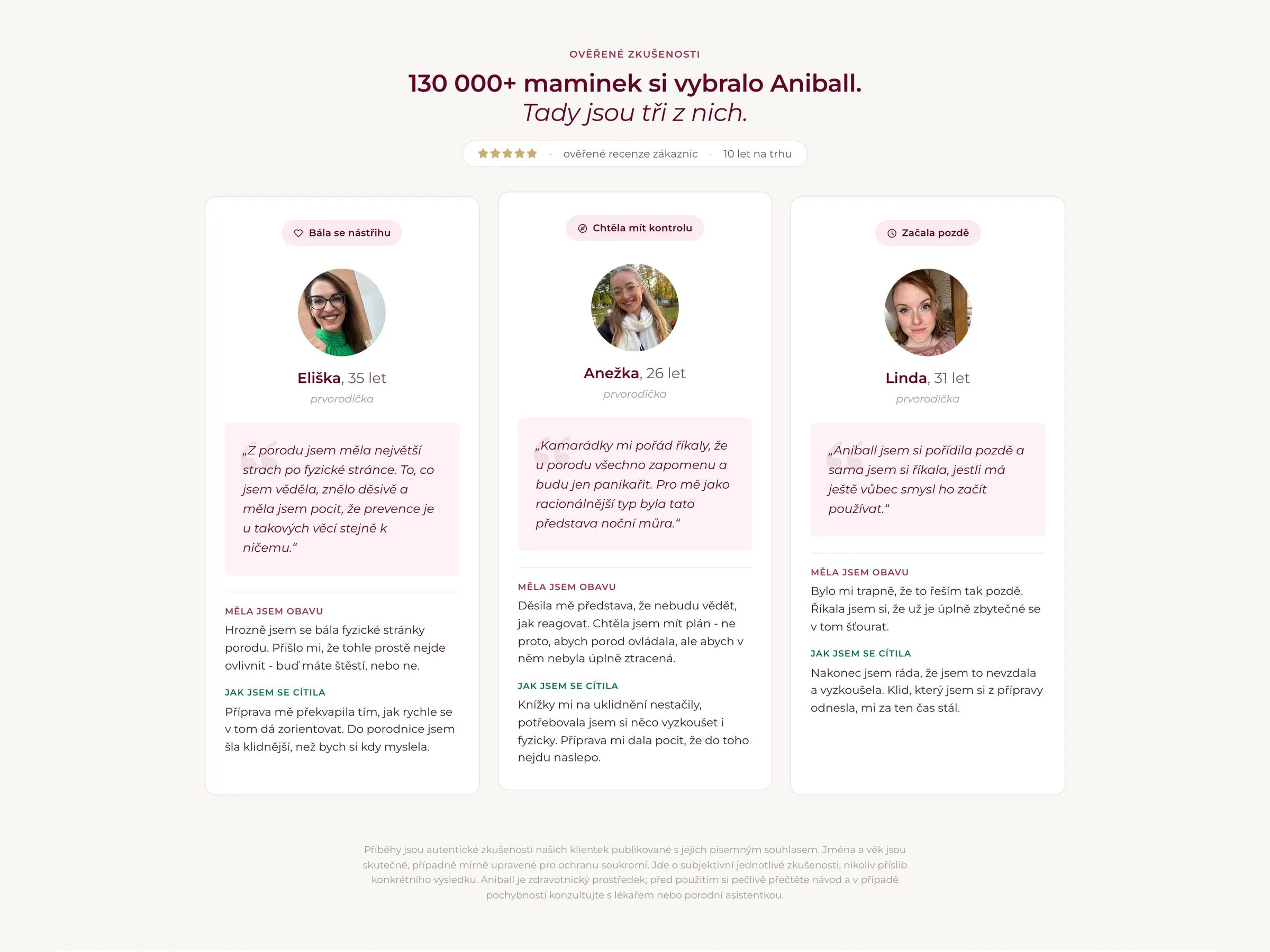
A hundred and thirty thousand women, three stories
The figure "130,000+ mums" does nothing on its own – it is too large for anyone to identify with. So the section breaks it down into three specific experiences. The original page had none of this; there were no star ratings on it at all.
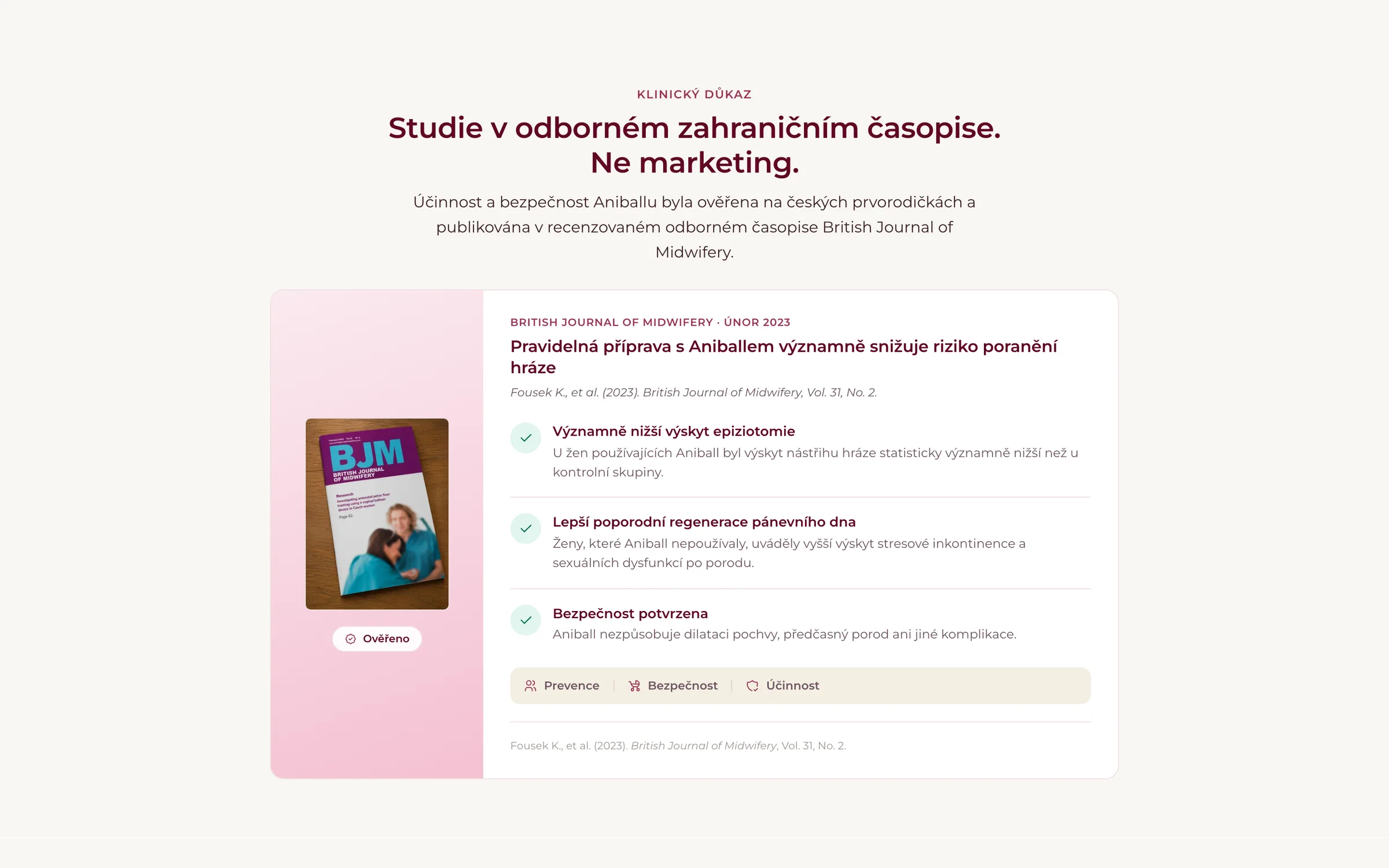
Aniball has a study published in the British Journal of Midwifery behind it. For a medical device that is the strongest argument there is, and it was nowhere on the old page. Now it has a section of its own, with a heading that lets the reader draw the conclusion.
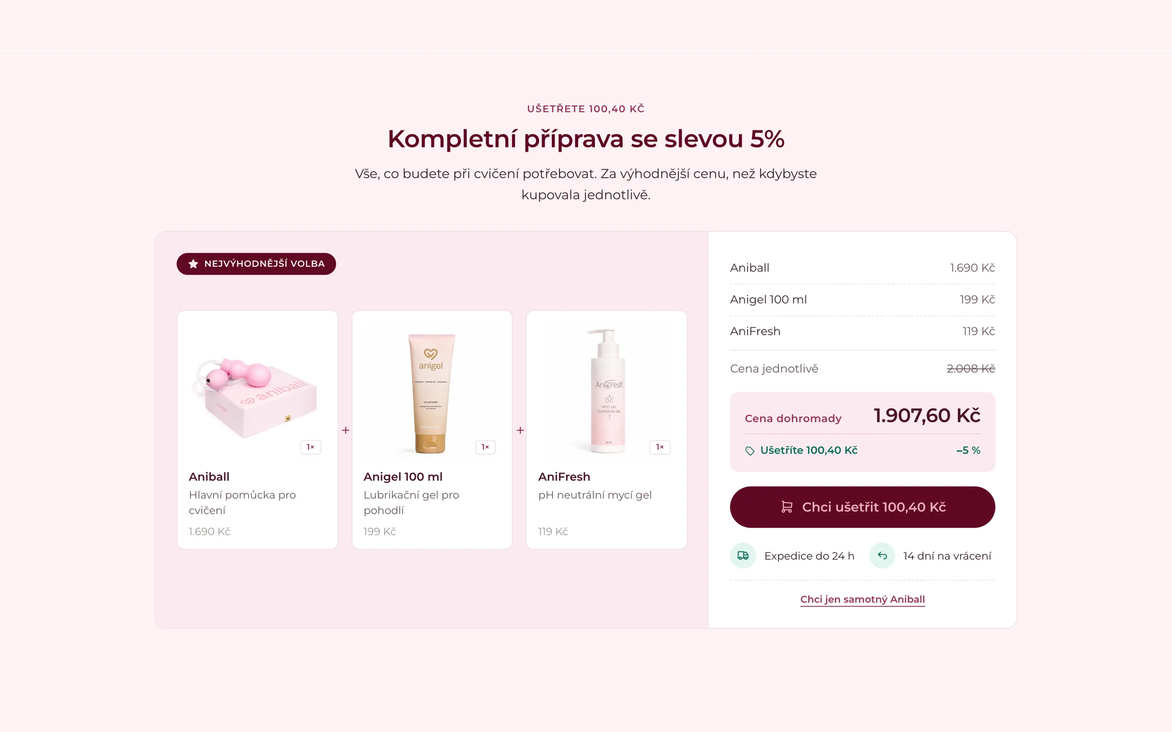
The device belongs with the exercise gel and the aftercare product. Previously a customer had to assemble that herself from the catalogue, so most did not. A bundle section with its own logic offers the complete preparation in one step, shows the difference against buying separately, and leaves a way out with a link to the device on its own.
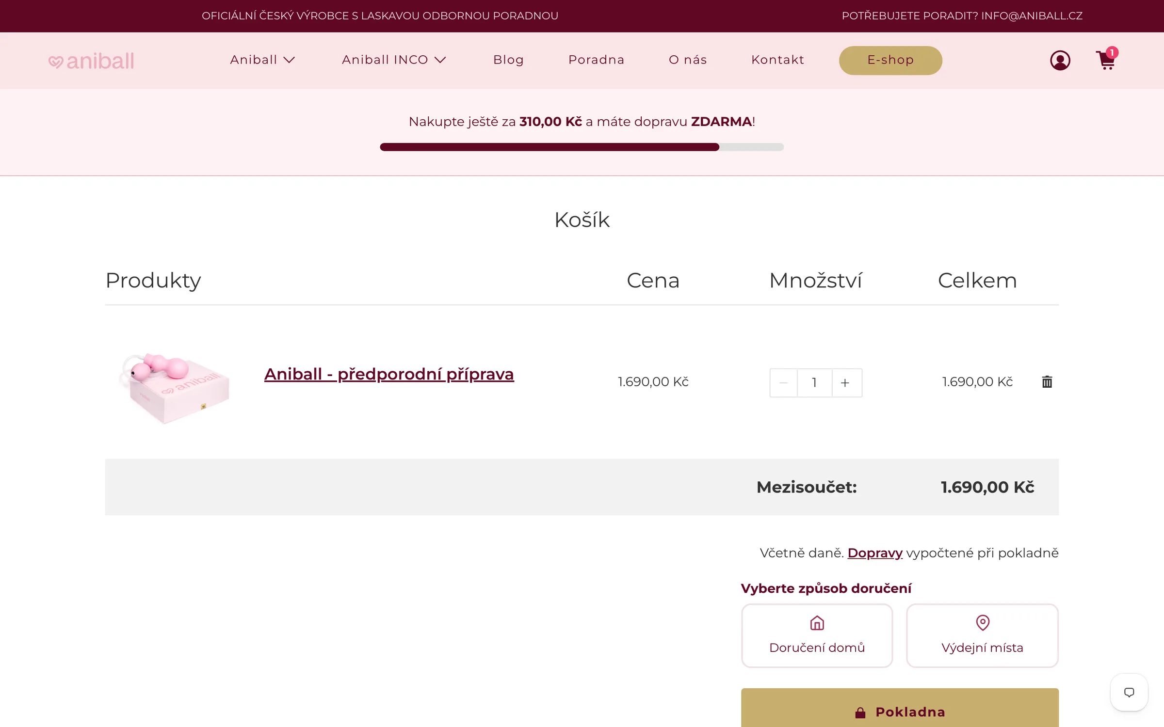
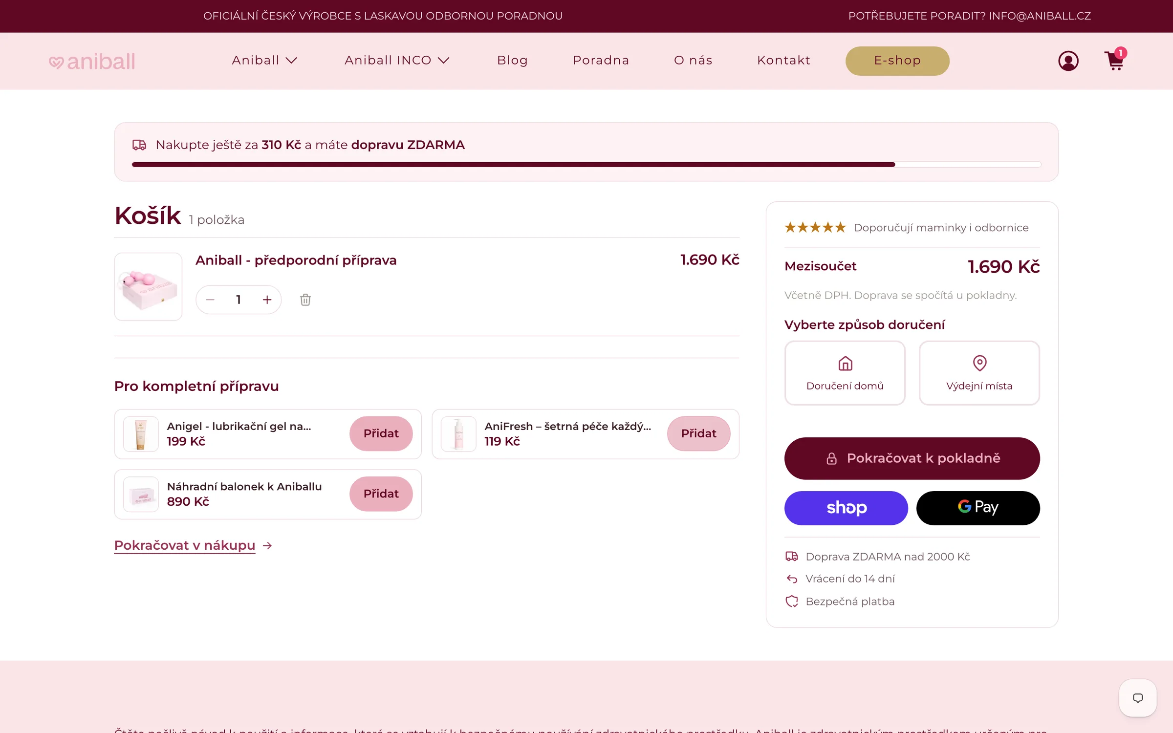
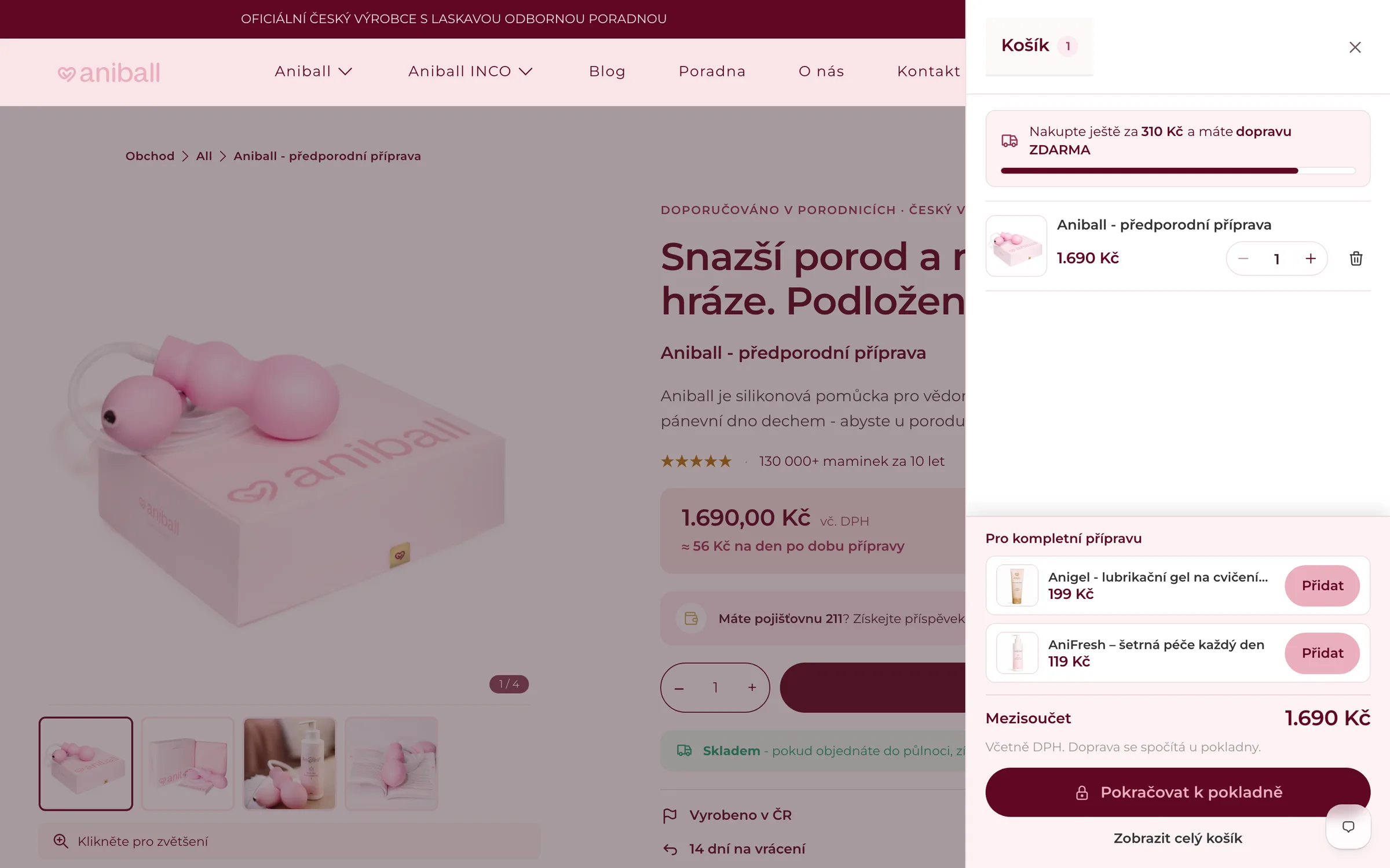
The original cart was a Products / Price / Quantity / Total table – an interface from another era. The new one is a card with a clear hierarchy, express payments and a "For the complete preparation" cross-sell that offers what genuinely belongs with the product. Free shipping and the return terms are visible before anyone starts thinking about leaving.
Clicking the cart icon used to mean leaving the product page for a separate address. Anyone who only wanted to check what was in the cart lost the page they were reading. Now the cart slides over it – complete with add-ons and how much is left to qualify for free shipping.
Under the hood
How it is built.
Every section is written in Liquid as part of the theme. Not assembled from apps that overwrite each other’s styles and charge a monthly fee for the privilege.
The bundle has its own pricing and availability logic, not a generic app taking a commission on every order.
All of it happened while the store was trading. New sections only went live once they worked – the store kept selling in the meantime.
Scope
What here is not mine.
The homepage, categories, blog and advice section are somebody else’s work. This case study covers the product pages, the cart and cross-sell, nothing more. The "before" screenshots show the state I inherited, not an earlier attempt of my own – and both sets are from the Czech storefront, where the work was done; the same design runs on the European store you can open above.